Operating notes
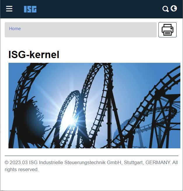
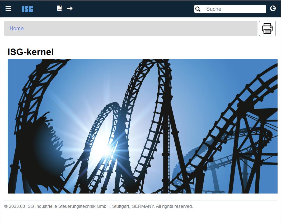
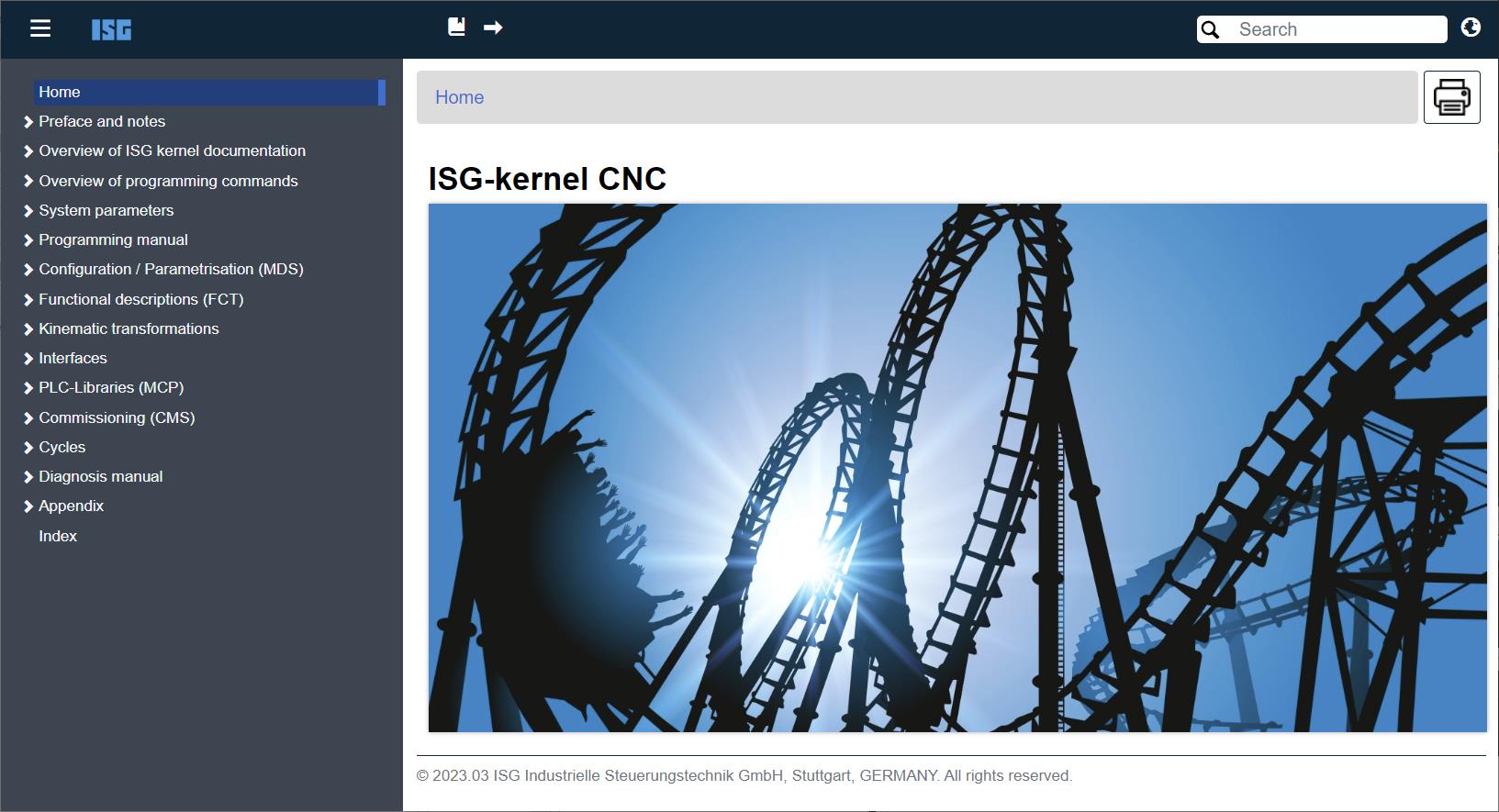
The website resizes automatically to the available display width (responsive design). There are 3 different display modes available:
- Mobile Mode (up to 576px)
- Tablet Mode (from 577px to 1199px)
- Desktop Mode (from 1200px upwards)
Depending on the optical resolution of the display (portrait or landscape format), tablet or even desktop mode may also be displayed on small devices such as smartphones.
Notice

Smartphone or in mobile mode
Due to the large number of producers and display sizes, there is no guarantee that the HTML Online Help will automatically select the correct view. The menu may sometimes be displayed on the left or the actual contents are presented in a very narrow format. This occurs especially when the smartphone or tablet is held upright and the pixel resolution of the display is just above the limits listed above.
In this case, we recommend collapsing the menu using the three dashes at top left or, better still, holding the device horizontally.
Viewing in Mobile Mode:

This view is the minimum one and is only recommended for briefly viewing or browsing information. Tables in particular can only be reduced in size up to a certain degree since they often have a fixed width. This means that images of tables are often truncated in Mobile Mode and the user has to scroll to view all the content.
- The table of contents is packed in what is known as the “Hamburger menu”. It consists of three stacked horizontal bars and is located at the top left corner of the screen. It can be collapsed and expanded.
- The ISG logo immediately takes the user back to the start page https://www.isg-stuttgart.de
- The Search function is called by clicking on the magnifying glass symbol displayed under the navigation bar.
- The language selection function is contained in the globe icon at top right. You can switch between German and English on the fly for each page.
- The bar highlighted in grey at the top of the page is the so-called “Breadcrumb Bar”. It serves as a means to orientation by displaying your current location within the Help section.
- On the right-hand side of the grey breadcrumb bar you will find a printer symbol, which you can use to print out the current page in a printer-friendly format.
- Tip: Especially for content in wide formats such as larger tables, we recommend the view in landscape format.
Viewing in Tablet Mode:

- The functionalities of the start page in this mode are relatively analogous to those in Mobile Mode. The only exception being...
- …that the Search field is immediately visible in the upper right-hand corner and
- that an additional quick-navigation function taking you forwards and backwards between pages appears at top right next to the ISG logo. This is the recommended function for quickly browsing between the pages, especially on a smartphone.
Viewing in Desktop Mode:

- In Desktop Mode the user immediately gets the full view of the content, including the Navigation Menu on the left-hand side.
- You can hide and unhide the Navigation Menu at any time using the so-called “hamburger menu” with the three parallel lines in the upper right-hand corner. Especially for tablets with higher resolutions it can be useful to hide the menu in order to have more room for displaying content.
- The full-screen view can be activated in the desktop browser by pressing the F11 key. Press the key once more to deactivate the view.
General operating notes
Independently of the view mode selected, the section below gives you a few tips for navigating on devices that have no touchscreen and some general browser navigation instructions:
- Is the font displayed on the PC in Desktop View too small? You can simply upscale/downscale the view and thereby the size of the font using the mouse wheel while holding down the CTRL key (up/down). In the default case: For upscaling the view, scroll upwards with the mouse wheel; for downscaling the view, scroll the mouse wheel towards you, i.e. downwards.
- You can easily display a (2nd) new window by right-clicking the mouse in the Breadcrumb Bar or in the Navigation Menu and selecting “Open link in new tab/window”.
- In the browser of your choice, you can also navigate through the menu relatively quickly using the tabulator key (the double-arrow key on the left-hand side of your keyboard). Alternatively, you can use the little arrow keys in the upper menu to navigate forwards and backwards between the pages.
- In the Table of Contents, the menu options marked by an arrow [>] can be quickly expanded by clicking the right arrow key and collapsed by clicking the left arrow key - provided the menu option has a sub-option.